Introducing the Pop Health Dashboard
April 30th, 2018 | ArchiveKeeping all providers aware of and engaged with the quality measures that drive the network’s success in population health is an important priority for the AHP team. While primary care providers can access the Arcadia Analytics dashboard to see their own performance to quality, specialist providers do not have access to that tool.
To ensure that we are reporting our aggregate performance to quality consistently, the population health dashboard pictured below was developed. Based on data for ALL patients in a rolling 12-month period, the individual speedometers’ black indicator shows our current scores in terms of percentile performance, while the gray indicator shows our performance in the prior 12-month period. Next to each speedometer is an indicator demonstrating improvement, regression or static trending.
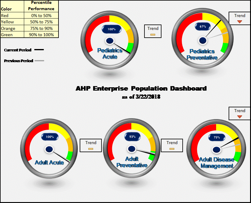
You can expect to see the Pop Health Dashboard in every issue of Network News and AHP5. Questions about our network’s aggregate quality performance or the dashboard? Contact Renée Sutton.


